Design of Gaming Sites: Trends and Directions of Development
Experts of the Rosloto studio will describe the modern visual identity of gambling resources. From us, you can learn how to create a unique and recognisable platform that will have tremendous success among players.
Advantages of the High-Quality Visualisation
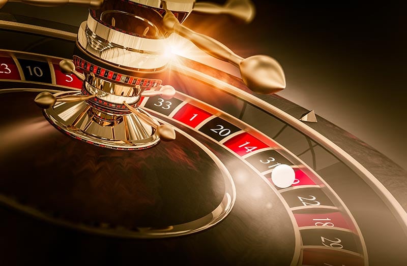
Web design does not stand still: new popular trends are constantly emerging. If about 5 or 7 years ago, the product range and the probability of winning were the main factors that attracted the audience, things have changed today.
Good visual elements are one of the key points that customers notice when they visit a digital casino. Appropriate and relevant design will provide aesthetic pleasure from the gameplay, making people who stay on the site feel comfortable.
Visualisation is so important for several reasons:
- A good first impression. It is formed within 30 or 40 seconds, after which players make a decision: to keep exploring the online resource or leave it. Thanks to the colourful design, users can start thinking positively about the platform on a subconscious level.
- High conversion. Thanks to interactive banners, pulsating buttons, flashing arrows, and other elements, entrepreneurs can attract the attention of the audience and encourage them to move from simple viewing to the target action. Bright navigation with unusual accents is much more effective compared to standard textual prompts.
- Excellent experience. It is achieved through gamification tools that correctly fit into the website’s structure. Already at the stage of viewing the catalogue, clients understand how interesting and high-quality the casino is.
Elegant and Modern Design
Let us consider the main trends in the visualisation of entertainment platforms.
Bright Colours
Most often, specialists choose 1 or 2 accent shades and a few additional ones. A combination of tones from the 80s and 90s with sharp transitions is also quite popular these days. Such an interface looks energetic and recognisable, and it will definitely not go unnoticed by players.
Bright elements are included in the list of the main components of poster design. This trend is characterised by catchy texts, large illustrations, screaming headlines, and interesting colour schemes.
Pure Minimalism
This is the opposite trend to the previous one. It involves a small number of shades/transitions, laconic forms, simplicity, sophistication, and calm tones. As a background image, operators can choose white, yellow, or sky-blue shades and place interactive rectangular banners.
The casino design in a minimalist style allows project owners to focus the attention of gamblers on such important things as:
- entertaining content;
- unique user experience;
- legal and safe play.
Complex Gradients
These are complicated transitions between shades in the selected colour scheme of the site. They replace simple linear or, conversely, radial gradients, which consist of 2 or 3 tones.
Such an option looks aesthetically pleasing and harmonious. It can be used to decorate background images, individual blocks, or banners on the digital portal.
The tool can help create small elements:
- cards;
- headings;
- buttons;
- logos.
Accent Details
With their help, operators can quickly attract and hold the attention of the audience for a long time, as well as emphasise the corporate style of their casinos.
Nuances that are used in the design of gambling resources are:
- Giant buttons. These are large, beautiful, and clearly visible keyboards that perform several important functions at once. They become quite an essential component of the overall stylisation of the site. Besides, such elements motivate customers to perform the target action (registration, depositing of funds, or activation of the reels). This increases the conversion rate in online casinos, and their owners make a good profit.
- Coloured typesetting. It looks more stylish and attractive compared to text in classic black or white. It is worth integrating the technique gradually: first, only the headings may have some tones, and then, operators can turn their attention to large fragments in blocks.
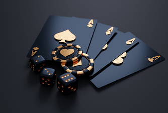
- Collages. This is an important component of poster design, and its popularity is rapidly growing. Betting platforms often make compilations of popular athletes’ photos. On iGaming portals, it is possible to use images of dice, cards, and tables with jackpots.
- 3D elements. They give digital resources depth and volume, as well as form an interactive environment where users want to try their luck and win big prizes. It is better to start with simple models/illustrations and make small elements (buttons, arrows, or logos) movable.
Interactive User Interface
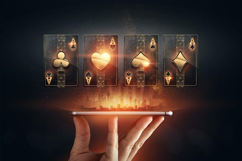
The online casino design should not only be beautiful and impressive but also engaging. Good appearance motivates players to start interacting with the website as quickly as possible: fill out the registration form, go to the entertainment catalogue, and launch the reels in digital slots.
Such an experience can be improved thanks to special components. All of them are part of a large area of design called UX. It is aimed at creating an enjoyable impression of the interaction with the service through visualisation elements.
Among the most popular solutions of this type, we can name:
- Animated transitions. They develop a harmonious picture and protect against fatigue caused by gambling. Most often, designers add smooth transitions between different screens, banners, and symbols in slots.
- Personalised features. These are customisable avatars/gifs, the ability to change the background image, and other individual offers. High-quality visualisation makes such elements bright and memorable. They also enhance the positive effect of receiving them.
- Gamification options. They stimulate further participation in the session and make the people’s stay on the website pleasant and unforgettable. Most often, operators use progress, achievements, and awards since these are the tools that have the greatest impact on the user experience. The designer's task is to carefully draw all the images.
- Scrolling. This is the movement of text and graphic elements in two-dimensional space. This gives players a feeling of interaction with the casino interface.
Gambling Atmosphere
It is important to integrate various thematic solutions into the design of entertainment platforms:
- tables;
- card decks;
- chips;
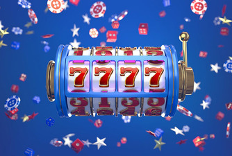
- icons of slot machines;
- images of popular characters and other attributes.
Many specialists resort to thematic decoration. For example, an online portal can look like a gambling hall in Las Vegas or Macau. Such a resource will stand out among competitors and generate income.
No matter what option operators choose, the colours will always affect the players’ perception of the website:
- Shades of red are associated with risk and victory. This also means big money, primacy in any endeavour, success, and leadership.
- Green represents safety. With its help, it is possible to emphasise that the casino provides legal services and cares about the protection of its customers.
- Gold reflects wealth and a luxurious life. The combination of red and gold is always a win-win and is often found in oriental-themed slots.
- Blue/white tones look calm and peaceful. These colours symbolise trust in the online platform and demonstrate maximum comfort.
Mobile Compatibility
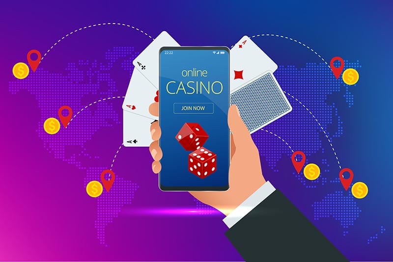
To log in, modern players use different devices: from compact gadgets to huge desktop PCs. The designer's task is to ensure fast software loading, as well as impeccable picture and sound quality.
Mobile compatibility is an important condition for attracting solvent traffic. Therefore, the creation of specialised design is coming to the fore.
Features of such an interface:
- the good loading speed of program components;
- reasonable arrangement of blocks and elements;
- consideration of the parameters of different types of devices, including extension, amount of RAM, and other characteristics.
Since 2021, Google algorithms have first indexed the mobile version of the website and only then the desktop version. Therefore, it is important to create a design for both formats so as not to lose valuable Internet traffic.
The Main Things about the Visualisation of Entertainment Portals
Importance of Quality Visualization

- Users form opinions in the first 30-40 seconds
- A vibrant design subconsciously creates a positive perception

- Interactive banners and buttons attract attention
- Engaging navigation outperforms standard text cues

- Gamification tools enhance user interaction and satisfaction
UI of Gaming Websites


Key Design Trends

- Designers use 1-2 primary colors with additional accents
- Popular retro colour schemes from the '80s and '90s are trending

- Simple elements, clean shapes, and calm colour palettes
- Focus on content, user experience, and legal, secure gaming

- Smooth transitions between multiple shades
- Used for backgrounds, banners, and critical site elements

- Giant buttons boost conversion rates
- Colorful text and 3D elements enhance site depth and interactivity
Gaming Atmosphere

- Integrating thematic elements like gambling tables and slot icons
- Example: Las Vegas or Macau-style casinos

- Red for risk and victory, green for safety, gold for wealth, blue for trust
Mobile Device Compatibility


This is the key to the success and prosperity of any online casino.
Aspects that entrepreneurs need to take into account:
- Good design solves many problems. It helps operators attract/retain customers, increase conversion, and strengthen image indicators.
- Among the latest trends in this field, we can name pure minimalism, complex gradients, and accent details. Many also use bright colours and transitions, which are part of the popular poster style.
- An interactive user interface improves the quality of the client’s experience. Specialists apply animated shifts and scrolling, as well as integrate personalised functions/gamification elements.
- Mobile compatibility is a prerequisite for creating a good design. Business owners need to take care of fast loading speed, reasonable arrangement of blocks on the screen, and harmonious combination of colours/fonts.
You can order a turnkey platform, a White Label project, scripts, and other modern products from the Rosloto studio.
We also provide such useful services as:
- sale and rental of games;
- drafting a business plan;
- assistance in obtaining a licence;
- integration of payment systems;
- promotion of iGaming projects, and much more.
Check the information used to contact us carefully. It is necessary for your safety.
Fraudsters can use contacts that look like ours to scam customers. Therefore, we ask you to enter only the addresses that are indicated on our official website.
Be careful! Our team is not responsible for the activities of persons using similar contact details.

